Should Have Stayed on the Road

Being on the road is difficult. Not excruciatingly so but, nonetheless, it is a distinct break in the continuity of one's life, the banalities that we take for granted.

That said, in reflection, coming home when I did was probably not the best choice I could have made. As I said earlier, the gas company (Atmos Energy) had the easements torn up and they were busy installing new pipes and meters, and city inspectors have been involved to approve ever step of the way (which, of course, slows everything down).


Read More

Flagstaff is a Whole 'Nother Town

My memory of Flagstaff is from the late '70s when I passed through after leaving the Grand Canyon with my then-wife and her parents. (Don't even ask. Just know that I have lived the nightmare.)

Come to think of it, I'm not sure that it actually was Flagstaff. It was that different. Back then, it was just a dry-as-a-bone strip of businesses, one of them a diner we stopped at on our way to Oak Creek Canyon, and there was a small mountain behind this strip of ramshackle businesses. All the same height, basically a ridge that ran the length of "town."

(Picture should have gone here.)


Read More

Road Trip and a Half

More Like Half a Road Trip

My trip out west ended abruptly Friday morning and I headed back home from Flagstaff. Let me tell you. . . that is one long drive. I can't claim to have driven non-stop, however. I stopped in Albuquerque for a couple hours to visit with a friend I met on last year's road trip, Pratt Morales. He and his son, Chris, own Golden Crown Panaderia. At 77, he has so much energy and passion for his business that he puts me to shame.

(Gallery of images from the Road Trip are below.)


Read More

Early to Bed…

Can't say my body is tolerating the heat here in Tucson. Up the road, Phoenix is even hotter. And I haven't had the normal (for me) time to acclimate to warmer weather that I have in Dallas. This trip has put me through some radical changes in climate in a short period. I've been picked up out of the frying pan and thrown into the gaping maw of Hades. (Oh, my God! It's global warming!!!) 

(Photos included below.)


Read More

Gimme Some Rhythm

You know, every city has its own rhythm. When people rise, when they eat, what and where they eat, the length of their commute — all the things that go into making up our daily lives. It's a rhythm. 

Tucson — and, I suppose, all of Arizona — share the rhythm of being out of sync with most of the rest of the country. While the rest of us are locked into Daylight Saving Time, Arizona & Hawaii do not observe it. It's the heat, they say. It's hot. And we don't need any more of it. No matter how dry it is.


Read More

Drive to the Edge of the World

Well, the edge of Texas, anyway. That's where I gassed up before leaving my home state for points westward. Seriously. The gas station was a hundred yards from the TX/NM border.

The transition from Texas to New Mexico is quite distinct. Geographically and in terms of the state of mind. Now, in comparing and contrasting the two states, I'm sure to get in trouble with fans of both. That said, it seems to me that Texas is dirtier/dustier than New Mexico. I think it may have something to do with its political boundaries. Texas, of course shares 1254 miles of the 1954 miles of US-Mexico border. New Mexico. . . mmmm, not so much: 180 miles.

At least on IH-10 between the Texas border and the border with Arizona, and IH-25 from Las Cruces and Albuquerque, New Mexico seems to spend a bit more money per mile of highway than the Lone Star State. It shows. It's really a pleasure to drive on NM highways.

Somewhere between El Paso and Las Cruces

Somewhere between El Paso and Las Cruces

The geography changes distinctly, though not dramatically. NM becomes less dusty and more like the scrub brush of West Texas. And flat. FLAT. Except for the bigger mountains in the distance.

I haven't seen so many clouds in quite a while. Big, puffy, white cumulus clouds. The kind that you'd imagine were dragons and airplanes and dogs and horses when you'd lie on your back with your best friend, staring up into the summer sky when you were 10 years old.

There were so many clouds, I simply had to stop and photograph them for stock purposes. I frequently use shots of clouds to liven up a "bald" sky. (Have I mentioned that?) It's hard to find images that are usable when you spend most of your time in the city, bounded by telephone poles and wires strung here and there and big (and sometimes ugly) buildings getting in the way of a clean skyline. So, I did a lot of shooting on the way to Tucson today. People passing by probably thought I was a little off.

A few miles closer to Las Cruces

A few miles closer to Las Cruces

Arriving in Tucson about 8:30pm local time, I found my hotel (a Best Western near the airport) and was not terribly impressed. That'll happen when you stay at the Soluna Hotel in El Paso. I've become jaded.

Okay, I've got to get up at 4am because local sunrise is at 5:19am and I'm not sure where I need to be at the crack of dawn.

So. . . night-night.

Better

It's amazing what a good night's sleep will do to refresh and replenish the body, mind, and spirit. Staying at the Soluna Hotel has proven to be my oasis on the road and I highly recommend it. It's like staying at home.

This morning I dragged myself out of bed (it's a me thing not a road thing) and headed out to meet the sunrise. Finding the same spot as last year, I had rays of sun across my left shoulder striking the façade of El Paso High School as I photographed it again, this time without the gray skies to contend with. ¡Mucho mejor!

El Paso High School

El Paso High School

I headed downtown to see the progress made on the plaza that had been under construction for at least a couple of months at the time of my visit last year. Couldn't believe my eyes! STILL under construction. It's a freakin' park, people! So far, it's been over a year since they started it and it's scheduled for completion in the fall. Over thought, over engineered, and under facilitated. Word on the street is, no toilet facilities. Yikes!

But, I found a little coffee shop right on the plaza called the Coffee Box. GREAT coffee! Very nice lady running the place, too. I'll have to find out who owns it. It's built with two railroad container boxes staggered lengthwise. An outside stairway leads up to an art-filled seating area. Very cool idea. And they don't gouge you for a cup of coffee like the green logo guys. Hope they're very successful.

Coffee Box in El Paso. So much better than the green logo guys.

Coffee Box in El Paso. So much better than the green logo guys.

Ran into another shooter, Christ Chavez, who was downtown shooting a ground breaking for an Artspace (live/work spaces for artists) and he recommended a diner up the street on Mesa for breakfast. I was out of sunlight by 9:30am so I headed up the street for a mordida. . . a bite.

Although I can't say the breakfast was very good — surprisingly — I met and had a great conversation with a young man named Joseph Cyr. He teaches French and Spanish in Tucson and he writes part-time for Afar.com, an Arizona travel guide. At least, his part of it is about AZ.

Joseph gave me a lot of tips on what to see and where to eat in Tucson and surrounds. So expect some of those to show up in the next couple of days.

As we were eating and talking, who walks in but my friend, Christ (seriously, he goes by Chris to avoid any confusion) and his buddy, Mitsu. It's like old home week. You know, I've been accused of being a people person but it's the camera that gives me carte blanche to start a conversation with virtually anybody. Without it? Not so much.

Josephine and Julia, my hosts at the Soluna Hotel.

Josephine and Julia, my hosts at the Soluna Hotel.

Staying at the Soluna Hotel is always refreshing. Just as it was last night. And it was all the more enjoyable because of the owner/operators of this little boutique hotel, Josephine and Julia, mother and daughter, who were most accommodating and helpful. Not to mention curious about my road trip. I think I've found two new fans. Yay!

Time to check out and hit the road. Goodbye Soluna Hotel and El Paso. Hello Tucson.

Reboot

Headed to El Paso after a long day. I'm staying at the same boutique hotel I stayed at last year — Soluna Hotel. Lovely place. Freshened up and went to a restaurant, at the suggestion of the desk clerk, Josie. It's called Carlos & Mickey's and I had a wonderful baked cod veracruzana. Delicioso!

Came outside right at sunset and was reminded how beautiful the light is here in EP. So I grabbed my camera and shot some stock images of clouds of the gray and white variety. I'm constantly needing them to replace "bald" skies; that is, when the sky is completely blue and boring.

Clouds for a rainy day

Clouds for a rainy day

Think I'll go by El Paso High School in the morning to re-shoot it. Last year, it was a gray, overcast day and the lighting was really flat. Unfortunately, sunrise is at 6:01am. Which means, I need to be up by 5am. (!!!)

Not sure what else I'll shoot. I may upload some images while I have a fairly fast Wi-Fi. In any event, checkout is at 12 and I probably will hit the road toward Tucson.

What Are the Lessons I'm Supposed to Be Learning?

Since I began this trip, I've been bone-tired and oh, so sleepy. I didn't plan it within an inch of its life so I'm surprised at every turn. And not in a good way.

Scenic Overlook at Fort Davis State Park

Scenic Overlook at Fort Davis State Park

I've created some fairly good images, yes. But I don't seem to have any focus. Other than taking a few landscape shots.

Lone tree on the way to Marfa

Sitting here in my truck in Marfa updating my blog and Facebook only because none of the galleries are open doesn't seem to be a very productive use of my time. I haven't been able to connect with my niece due to an odd set of circumstances. It's a long way to drive to miss out on seeing her and the kids.

I think what I need more than anything is to head to El Paso, check into the Soluna Hotel (a little boutique place I stayed in last year), and sleep till I can't sleep anymore. Then, start afresh in the morning.

What do you think?


Where is a photograph made? In camera or in Photoshop?

The two schools of thought on this subject are at utter apposition. There are those photographers who adamantly insist that a photograph should be created in camera through traditional (or non-traditional but outside the box) means. Others believe that RAW pixels are merely the raw material for making an image great and that tools like Photoshop (PS) and Lightroom (LR) pick up where Ansel Adams' Zone System left off and are where a photograph truly takes its first breath.

Us? We let the photo be our guide. Often, the main objective in camera is to light the subject/scene properly and/or in a way that (with current technology) cannot be simulated in software and to compose the image as simply as possible, whether we zoom with our feet or our lens. Cropping in camera, in our view, makes for a larger possible print than cropping in PS/LR.

At a minimum, every final selection from a shoot is dodged and burned (to use old-school terms) and sharpened. We also will adjust the histogram (the display of distribution of light and dark tones) so that the image is printable. That is, the image should have no blown highlights and few, if any, plugged up shadows with no detail. 

After that, we remove objects (telephone wires, unwanted birds too far away to be of interest, lens flares, stray hairs, etc.) that detract from the subject/scene.

Once all this is done, a photograph will tell us whether it's done (stick a fork in it) or it needs further manipulation. Sometimes, it will call out for another element -- clouds in a bald, uninteresting sky, let's say.

Let's stipulate that that's exactly what it needs. Clouds. We keep a folder full of clouds that we photograph for this very purpose. Here's an example of just such a photograph:
Yes, we know It's not a photograph taken all at the same moment. Get over it. Composite photos have been made almost as long as photographs have been made.

And this one, as they go, is a pretty simple one to execute. Merely select the aforementioned bald, uninteresting sky, refine the edge along the treetops to prevent a white outline, mask the clouds with the field of hay and trees, and you're almost done.

Doing this kept us from having to wait days or weeks for the proper clouds and take the chance that the field would be cleared of the hay, and it also affords us the flexibility of adjusting all the elements of the both sky and field independently -- contrast, highlights, shadows, sharpness, etc.

Even though this is a composite, we did everything we could to frame and expose both elements. We waited about half an hour for the last bit of sunlight to skim across the field and hit the hay at just the right angle. The shadow from the horizon was moving so quickly that next frame was half-covered in shadow and the hay rolls were where they were light moments before.

The clouds were almost as difficult to capture. Shooting them from a high vantage point to remove clutter and bracketing exposure to pump up the contrast and make sure there were no blown highlights took some experimentation, too. As a result, they became a bit more ominous than they appeared to the eye. Adjusting them in PS/LR helped to exaggerate that effect.

—ø—

So, when it comes to making a good photograph, we go to one school to get what we can and then on to another to make the most of all that we learned. It's really an ongoing exercise and we never fail to learn something new with every photograph.

~ Lawrence Standifer Stevens


Lawrence Standifer Stevens has been a photographer longer than he can remember. Quick! Subscribe to his newsletter and if he can remember the password to his computer, he'll pass along some tips and advice to help you improve your own shooting.

Too-ta-doooooooo!

I don't often toot my own horn but this is one time I couldn't pass it up. Huffington Post UK has included me in a compilation of the 12 Top Emerging Digital Artists On The Internet. Cooler still, my painting, Nebula, is the number two sample image included in the slideshow at the bottom of the page. I suppose I sound like a naif for writing about a press notice but, what the heck? It's my first international exposure and I'm kinda diggin' it. Very cool. 

After only a few days, my Recent Visitor Map on my website looks like this:

visitor-map.jpg

What amazes me is the amount of traffic INCREASE in such a short time - just a few days. 

The image they included in the HuffPost UK article is pretty small and doesn't show much of the texture in the piece. I suppose that's why most of my art is around 48" square or larger, to show off the texture.


Nebula

After you've taken a look at the other artists in the article, I invite you to come back and take a look at my artwork. Everything you see here is for sale and is fairly good size; as I said, about 4 ft x 4 ft or larger. I print on a variety of media: heavy watercolor paper, canvas, metallic paper, or face-mounted on ¼" acrylic sheets with a floating mount. . . whatever the piece dictates. 

If you have any questions, please feel free to contact us.

~Lawrence Standifer Stevens

How to Edit Your Own Photography

Editing your own photographic work need not be an unbearable chore. Think of it in terms of uncovering hidden gems among all the costume jewelry in your old Aunt Ethel’s trunk in the attic after she’s passed away.

I use a four-step process (generally) and it doesn’t take nearly so long to do as it does to describe.

1st Pass

As Fast as Possible

I pretty much use Adobe Lightroom (LR) exclusively for my production editing, switching over to Photoshop (PS) only when the edit is complete and, then, only when I want to do some heavy lifting for which LR is just not the proper tool.

There are any number of workflows one can use in LR (and in PS) — and although some may very well be objectively better than others, it boils down to what you are most comfortable with. So, I’ll skip most of the specifics of dealing with both those programs and stick to the Mile-High View of the process.

That said, here’s an exception to my own damn rule about staying above the process: After importing images into Lightroom, I set my Filters (lower right corner, above the “filmstrip” of images) so that the Left and Center flags are active.

Adobe Lightroom Filter Settings to make rejected images disappear from view.

Adobe Lightroom Filter Settings to make rejected images disappear from view.

This may not be THE correct way of doing this but it works for me and that’s all I care about. What this does is allow me to not only Reject images but make them disappear from the filmstrip so I no longer have to see and deal with them. This is important because it frees up that part of the mind that constantly is asking, Accepted? Rejected? Evaluate? Move on?  whether or not you’ve already done any of those things. Quite literally, it is a case of out of sight, out of mind. This saves a tremendous amount of mental energy and keeps the edit moving forward.

I make the filmstrip as large as possible, select the first image in the imported frames, and move forward as quickly as I can using the arrow keys. Using only a general impression of the image, I will Select or Cull an image. It needs to jump out at me to keep it. If an image does nothing for me immediately, I Reject it (using the X key) and move on to the next frame.

Use General Impressions Only

This is where you reject clearly out-of-focus images, shots with the subject in mid-blink, and goofy expressions. Plus, shots where your flash didn’t fire or recycle fast enough get 86’d, and operator error such as camera movement or incorrect exposure get the axe. But it’s really only the most obvious problems that will catch your attention. I tend to squint a bit to keep from being sucked into the minute details of a photograph.

Squinting demonstration. Do not try this at home. Trained professional on a closed course.

Squinting demonstration. Do not try this at home. Trained professional on a closed course.

Eliminate, Don't Ruminate

The whole point of the First Pass is to go through all your images as quickly as you can. You don’t want to think about the merits of each and every frame. Nuh-uh! You want to blaze a trail through those 2000 shots of your niece’s wedding, and you want to do it fast. Evaluating every little element of each shot will cause you to pull your hair out and run screaming into the night. Don’t do that! You’ve got work to do.

2nd Pass

Do It Quick but Use a More Discerning Eye

The second pass through your images is a bit more deliberate. It’s still pretty quick but now you’re beginning to notice details. There are slight differences, often, between two very similar shots. Take note of the things that might cause you to do a lot of post-production work. Sometimes, time is the only important difference. In two shots, one only slightly better than the other, the one that requires more processing time because — I dunno — say, someone’s finger (don’t go there) suddenly twitched and it looks really weird and retouching it would take 20 minutes to fix. Do you go there? Sometimes the answer is Yes. Why? You need the hands-on practice with retouching that particular finger “thing” or the client really, really wants it or. . . come up with your own reason. Quite often the answer is No. There are too many fixes needed, that take too much time, and there’s just not that much to gain in terms of quality.

Notice those things but be cautious about fixing everything. It’s a time-suck.

Do A:B comparisons in this pass. After you have done a few, you’ll begin to pick up steam and start rolling through your images like the 5:13 from Chicago to L.A. After a while, you begin to see both images like you were viewing them with an old-timey stereopticon.

A:B Comparison in Lightroom.

One thing I’ve learned about my own photography over the years is that the last frame in a sequence is more often than not the keeper. It saves a lot of time if you just go with the one that’s usually the best. You might be very different in how you shoot, however. As they say, YMMV.

3rd Pass

Slower Still - Grade Photos - Stars or Colors

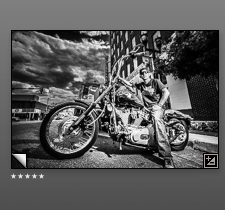
In Lightroom, there are a couple of ways to rate an image. I occasionally will use colors but I mostly rely on the star rating. If I think it’s going to be a Select, I’ll just go ahead and give an image 5-stars.

5-star rating

5-star rating

Sometimes, an image can still be used even though it’s not the absolute best of the sequence of shots of the same subject. I’ll drop the star rating to a 4- or 3-star rating but anything less than that is going to be rejected anyway, so I’ll simply press the X-key and reject them.

The lower star-rated images may not make the final cut but they may serve a purpose in stock photography. Or they may work better with a different crop.

4th Pass

Live with your decisions

Before you make the final pass, take a break. Unless you have to deliver the job right away, you can afford some time to “live with” your final candidates before the axe falls again. Think like a turtle not a hare. Make a slideshow and run it several times, hours or days apart. Or make small prints and put them up on a bulletin board or your wall.

Live with your photos for a bit. Do they stand the test of time?

Live with your photos for a bit. Do they stand the test of time?

Go through them often and look deeply into each one. Soon, the ones that want to hurl themselves onto a rocky shoreline at the bottom of a cliff will jump out at you and scream, “Get me outta here! I can’t stand living with these guys! They’re so good. . . and I’m just NOT.”

That’s when you start downgrading the photos or outright rejecting them. They will speak to you. All you have to do is listen. The only thing remaining to do is to do your typical post-processing to your Final Cut.

Before you know it, you’ll have finished your edit and all will again be right with the world. Now, go shoot some more. It’s not nearly so hard as you thought.

~ Lawrence Standifer Stevens

UPDATE 12/1/14: Joe Dantone, a Fine Art Photographer, responded with this little tidbit: 

I hate being so picky, but I think what you described is photo editing, not editing photos. If that is true, you might explain the difference.

And he is absolutely correct. I might. Next time.


Lawrence Standifer Stevens has been accused of far worse than having a name that's just way too long. He's a triple threat — he paints, he shoots, he writes, he does voiceovers, and he tells a remarkably boring story that often has listeners on the verge of piercing their eardrums. Wait. That's five threats. But who's counting? Visit his galleries and see his photography right next to his artwork. Amazing how he does that! Putting them so close together. Who'd a-thunk?

4 Ways to Make Your Photographs Pop

Okay, I lied. There is only one way to make your photographs "pop." Print them on balloons!

Seriously, if you want your images to have greater impact, even before you open up Photoshop or Lightroom, do the following in camera when you are taking your photo:


Simplify It

Get rid of the clutter. Zoom in. If you can't zoom in with your camera, use your feet — move closer to your subject. 

Just the boxers. No ring. No ref.

Filling the frame with your subject guarantees more "pop" for your photos. When the subject is the same size as the rest of the items or people in the frame, it's hard for the viewer to quickly decide what that subject is. While the subject doesn't have to completely fill the frame, its size relative to everything else should make it clear that it's the dominant part and, therefore, the subject of the photograph.


Compose Yourself

Or, rather, compose your photograph. You've probably heard of the Rule of Thirds, creating or imagining a tic-tac-toe grid on your camera's viewfinder and placing the subject at the intersection of two of the lines. I use it frequently. But not exclusively.

There are any number of ways to organize a photograph. A few of them are: leading lines, s-curves, use of triangles, and so on. Most of them create a hierarchy of information, with the top of that hierarchy being the subject. 

Breezeway entrance to the Latino Cultural Center in Dallas. A good example of both Rule of Thirds and Leading Lines composition.

If you usually place the subject drop-dead-center in all your photos, you might want to take a look at doing it differently. Drawing the viewer into the frame toward the subject is the goal, however you compose your image.


Colorize 

Because of the way the human eye sees, red objects really jump off the screen, particularly on a blue background. This is because the eye cannot focus on both the red and the blue ends of the light spectrum at the same time. Sometimes with this color combination, you may experience a vibrating of the colors or even a faux-3D effect with red coming forward and blue receding.  

A very red 52 Chevy truck. Who knew that a 60+ year old pickup truck fender could be so enticing you'd want to lick it?

Often a different color will stand out from its surroundings, particularly if they are complementary colors. Using this method to indicate your subject is particularly effective for, say, fields of flowers. You'll often find one flower that is either a different color or a different color and a different species. Use those differences to your advantage.

Red isn't the only color that will "pop." It's just one color. No need to rush off and shoot nothing but red subjects. However, that's not a bad idea for collection of images or even a show.


Create Contrast

Technically speaking, contrast is the degree of difference between the blackest black and the whitest white in your image. And that type of contrast is definitely something you should strive for most of the time in your photos. (For every rule there's an exception, however.)

But let's talk about other kinds of contrast, shall we? Since the word contrast comes from two Latin verbs meaning to stand against, consider that opposites make good contrasty subjects. For instance, a photo of a big, adult dog and a sweet, little kitten almost always gets some kind of emotional and/or verbal response, regardless of how overused it may be. (Awww!) Forgetting for a moment the difficulties that scale presents, how about a photo of tiny Matchbox® car crossing the Golden Gate Bridge? See where I'm going here?

Feather on Slate Stairs

Feather on Slate Stairs

The kind of contrast that depicts subjects that are not often thought of together — a cop and an artist, a billionaire and a immigrant dishwasher, a clown and a doctor — create a third, implied, subject: the difference between them.


The Eyes Have It

It almost never fails. . . we are drawn to look into the eyes of those with whom we have are having a "conversation." That includes, I think, a photographic subject with whom we are having a brief tête-à-tête. If you can illuminate the subject's eyes more prominently than the rest of him/her, do it that way. Subtlely. If you can't use a flash or strobe to fill the eyes, use a reflector to bounce some ambient light into their eyes. A little bit of light works wonders.

Subtlety is the key. I had to use Photoshop to lighten the subject's eyes instead of a light or reflector but they certainly do "pop."

Failing all of that, you can do it in Photoshop or Lightroom. Since there about a ka-gillion ways of doing everything in Photoshop and somewhat fewer in Lightroom, I will leave the exact method you use to your Internet search skills. However you lighten the subject's eyes, do it with restraint. The whites don't actually have to be white. You don't want them to look like Godzilla shooting death rays out of his eyes, melting everything in his path. Leave that to the sci-fi special effects guys.

—ø—

These are just a few of the things that will help you to create photographs that "pop" off the page or screen and into your viewers' hearts and minds, and, perhaps, their wallets, too. Share your own techniques below in the comments.

– Lawrence Standifer Stevens


Lawrence Standifer Stevens has been shooting for longer than he cares to remember. But he remembers his first photo — a squirrel on a phone pole. And he can't get it out of his head. Perhaps you can help him forget. Subscribe to his newsletter and he'll tell you his photographic secrets.

Put a Bow on It

When I decided to take a road trip several weeks ago, I had no idea how involved it would be. And involving.

Three states, 10 cities, 2660 miles, 13 days. I haven't added up how much I spent on gas and accommodations but, needless to say, it was an expensive trip. But I got a good deal from my travels, too. More importantly, I met some really wonderful people. (And one jerk...but he doesn't count.)

Which brings me to why I make photographs of buildings. I do it in order to meet people. Life has been a blur since I returned home so I'm a little fuzzy on the details but a brief incident comes to mind that illustrates this point.

Once back in Dallas / Fort Worth, I went in to the studio to unload my truck and unpack gear. Sans camera, I went out for lunch or dinner — whatever — and found that I really wanted to photograph a person I saw across the way and get to know something about them. But without my camera, I felt this choking sensation, as if there were an invisible pair of hands around my throat. The more I wanted to get up and approach this person, the tighter the grip of the unseen hands.

That's when I realized the camera somehow gave me permission to be friendly, open enough to approach a stranger. Without it, I'm a pretty shy, private, reclusive type of guy, some would say even kind of aloof. Camera in hand, I can approach anyone, go anywhere, climb atop anything, even do some really stupid shit, thinking I am completely invulnerable. After all, I've got a camera in my hand. Nothing can happen to me. Right? Right?!? (Please, never put me in a war zone!)

Most important of all, however, is a simple goal I've had from the outset of this little project. That is, to complete something I started. A lifelong problem, this. But my intention, even though the photographs will have a life long after this road trip, is to bring it to a conclusion, finish it, put a bow on it. Not to leave it undone, hanging, twisting in the wind from a Mexican overpass like a corpse that will eventually stank up the place, y'all. Time to cut it down and bury it 'cause it's the past and it's dead, done, and gone. Time to move on to the next thing.

Check, please?!!

ROAD TRIP - DAY 12 & 13 - Dallas

Dallas

The hardest thing about the 2014 TX, NM, & OK Whirlwind Architectural Photo Tour for me, photographically speaking, has been seeing my hometown with new eyes. While this road trip has presented both treasures and challenges along the way, I never found it hard to be amazed and surprised when coming on a new building, large or small.

But stepping out to photograph the city that I grew up in and know like the back of my camera has proved more than difficult. I squint, cross and uncross my eyes, and let my vision go defocused, all in the effort to squeeze some newness out of my surroundings. I am not sure that I have succeeded. But here are my choices for my brief architectural exploration of the city I love — God forgive me — Big D.

You may have noticed — if you have kept up with this entire 13-day journey — that I seem to have a thing for churches. I do. I'm not sure why that is except that they often seem to be the most architecturally interesting structures in the neighborhood. Is that me or is that, indeed, true?

Since a church is an expression of all that is good in mankind and seeks to praise God in that expression, it seems logical that the architects and the congregations who commission them would often go the extra step to reach an aesthetic that reaches beyond the designs of secular structures. So I pay homage to that effort, that aesthetic, by including some of them here.

Corabeth's home and the Divine Sisters of Providence

Edgefield Iglesia de Cristo

Majestic Ark of Safety Holiness Church

Tyler Street United Methodist Church

At some point, a building can become co-opted by its neighbors. They take "ownership." You see this most vividly in the tags and mural art left by artists of varying degrees of talent. They make the building into a canvas and, suddenly, it has a new use, probably unintended by the architect. Nonetheless. .  . .

Sometimes the architecture is the canvas for another artist.

The last couple of years have seen the revivification and repurposing of an old Oak Cliff landmark, the Kessler Theater. The Kessler has marvelous acoustics and gives artists a place to really connect with an audience, and the audience a chance to see, up close, some excellent performers.

Kessler Theater

Nearby, the neighborhood south of W. Davis St. is mostly quiet but on this hot summer day you can almost hear the sound of children screaming, "Lemonaaaaaaade!" at the tops of their lungs. The perfect libation for a-sittin' and a-rockin'.

Oak Cliff Residence

Right on the edge of downtown Dallas, just east of US 75/Central Expressway on Live Oak Street, the Latino Cultural Center occupies a spot a few blocks north of Deep Ellum. It is host to a constant variety of events for the Hispanic community and those who appreciate their many, varied cultures.

Latino Cultural Center façade

Latino Cultual Center street entrance

Latino Cultural Center sculpture

Latino Cultural Center breezeway entrance

For whatever reason, parking garages have a special place in my heart. Probably because they get no respect whatsoever. Across Live Oak from the Latino Cultural Center, Elan City Lights is being built. Another apartment complex for the flush, upwardly mobile young person who want to live near downtown; the downtown that just can't seem to get defibrillated to the point that its heart has a beat of its own. But, I digress. At some point, I may see if I can photograph this new structure more closely. For now, it sits. Waiting.

In keeping with the healthcare motif of the area (which is home to Baylor Hospital), the Rehabilitation and Wellness Center helps folks overcome addictions. And, obviously, does it in excellent style.

Rehababilitation & Wellness Center

Down the street from where I live, in the non-profit section of Swiss Avenue, is this beautifully designed home of Dallas CASA (Court Appointed Special Advocates). They are advocates for abused children. Glad they're around to help these kids.

Dallas CASA

Downtown, the skyscrapers are still growing. The older ones, like Republic Center, hold their own. And the new ones keep sprouting like kudzu.

Republic Center home of the Republic National Bank building (the one with the spire atop it), now called Gables Republic Tower. When it was completed in 1954, it was the tallest building in Dallas and west of the Mississippi River. 

Gables Republic Tower

Can't get enough of some Gables Republic Tower.

When I was a kid, Republic National Bank was the coolest skyscraper in the world. It had a rocket on top of it, for gosh sakes! It was one of those buildings (and still is) that I could not NOT look at when driving by the city skyline. Then, of course, there was Time & Temperature sponsored by Republic National Bank. I still remember the number. Back then, there were no area codes and we had names for the exchanges. Say it with me now: Riverside 7-6651.

—ø—

Wandering to another area of downtown, I came across this little gem, below, at 1700 Pacific Avenue. In the brief time I was there shooting the cave-like niche in the building, I saw no fewer than 4 people step in from the sun and the traffic to make a call. The important thing, however, is that it exists at all. A fairly small, dark inset on the side of a building that gets a lot of use from people who a) want to make discreet phone calls or 2) need a place to get in out of the elements. In an age of the mega-scraper, knowing that there are architects out there who design for the human scale, for incidental use by people who may never cross the threshold of a building's portal gives me great comfort.

A niche for cell phone addicts.

Before moving on, a slight turn to my left revealed another skywalk. Setting up quickly, I was able to capture a few people rushing through my frame to some important destination. Opting for black and white instead of color, I chose to keep a small splash of red — the cap of the bicyclist — as a way to direct attention to the object of my affection.

Skywalk

Okay, call me gullible. As I was walking, head down, checking my last shot, I was startled by the gentleman you see below. I thought he was just resting a moment from sweeping all that trash. Then, I realized he wasn't real. I'm not really sure what his significance is but I feel cleaner knowing he's there. 

Sweeper statue

Behold, the AT&T building. If you squint, you can almost see a block-like, very geometrical sphinx. Wearing some very cool shades. Rather imposing, don't you think? And inscrutable. I know this because I had to call AT&T Customer Service yesterday.

AT&T

It wasn't until later in the day, sitting in front of my computer, editing photos, that I realized that this was the Dallas Branch of the Federal Reserve. Thought they moved to Woodall Rogers and Pearl. This must be the old location. Somehow this smaller one looks sturdier.

Dallas Federal Reserve Branch

Museum Tower, below, owned by the Dallas Police and Fire Pension System, has been mired in controversy at least since its completion. Evidently, someone didn't do their homework regarding the glare caused by the glass panels. They reflect an enormous amount of light onto the Nasher Sculpture Gardens, ruining, according to one artist, his sculpture. At his request, the Nasher closed down the exhibit to the public. That would be some pret-ty bad glare, my friend. Perhaps, they could start issuing welding goggles with every admission. A word of advice to the architects on future jobs: Angle of incidence equals angle of reflection. Sun 101.

Museum Tower residential "sky-rise"

Another favorite piece of architecture that has stood the test of time — and that's saying a lot in Dallas where it gets torn down if it's older than fifty years — is the Wilson Building. The interplay of light across the surface of the building is always interesting and photogenic at anytime of day or night.

The Wilson Building

Among the new, there are always the skeletons of the old, sometimes with a little flesh hanging onto those bones as a reminder of what was. I can't remember where the bars on the ground were, inside or outside. I believe it's the inside we're seeing with the reflection of the buildings across the street and diagonal. Somehow, this photograph makes me very sad.

Mosaic Behind Bars

The Cathedral Shrine of the Virgin of Guadalupe. Reaching for the heavens, it appears to be much larger than it really is. Surrounded by giants all 'round, she goes about her business quietly and does the work she was meant to do.


Cathedral Shrine of the Virgin of Guadalupe

A difficult image to create, my impatience shows here with the Belo Mansion; I couldn't wait for a minute or two for a cloud to pass so that it was in direct sunlight like the Museum Tower, behind it. The contrast between the two was almost too much to overcome.

Belo Mansion

This view of a parking garage at 606 Harwood dominates the skyscrapers around and behind it. It serves the building across the street, home to KPMG, the "audit, tax, and advisory services" powerhouse.

The parking garage and skywalk serving KPMG, across the street.

A simple wall, which, I believe, is around the Crow Collection of Asian Art, could have been left unadorned and no one would have said anything about it. But someone decided to line it with bamboo and it became something remarkable.

Bamboo Wall

The entryway to the Crow Collection of Asian Art is, by any standard, quite impressive. This very quick study shows me the possibility for a beautifully lighted photograph. "If you don't ask, the answer is always NO." Words I live by. Now, I just need to find the right person to ask. What I have in mind is referred to by some as "light painting," taking a base exposure with very little light showing and, then, exposing a large number of frames with a flash or flashlight of some kind aimed at specific areas. All these exposures are stacked in Photoshop and blended so that they eventually light up the entire scene. 

Crow Collection of Asian Art entryway

There is more but I need to stop and catch up on my image editing. Check back soon.

We're about to wrap up this road trip and call it a drive. We're working on a special section of the portfolio to display a selection of the images on a permanent basis. Tell us your favorites in the comments section and we'll see about adding them.

~Lawrence Standifer Stevens

ROAD TRIP - DAY 11 - Fort Worth

Fort Worth

After a good night's sleep in my own bed, I headed to Cowtonia 30 miles to the west to see what I could see.

Before I headed downtown, I took a drive through a neighborhood just east of the CBD — Northeast Fort Worth. Somehow, the area has figured prominently in my life of late (my sister lives there and I've been looking at places that might be suitable for live/work in the area nearby). So, a turn off I-30 heading north put me on Sylvania.

Andrew "Doc" Session Community Center

Fort Worth Harvest Church

The sun began its descent toward the horizon and I drifted toward downtown, where I found an old house at the corner of E. Belknap and N. Grove being used as a business. I knocked on the door, unsure if it was a residence or business but not wanting to be presumptuous. A young lady opened the door and seemed a bit perturbed that I would wait for an invitation inside so she could close the door. Not much of a conversationalist, she had no idea how old the building was, and a colleague confirmed the same, because they were leasing and had no clue how old the building was. I thanked them and was on my way. It wasn't until just now as I write this that I found out that it was a bail bondsman and a law firm I had barged into. That explains a lot.

Bail Bonds for the comfortably ensconced

Around the corner from the Bail Bondsman. Lots of lawyers in this area near the courthouse.

From there, I drove further down E. Belknap and parked across from the beautiful Tarrant County Courthouse where I started my walk.

Tarrant County Courthouse and the D.R. Horton Tower

Statue at the Tarrant County Courthouse

Onward around the CBD and I found this little gem, tucked away, in the shadow of glass and steel. Fire Station No. 1, with its tiny, narrow door, presumably for its tiny, narrow firetruck.

Fire Station No. 1 - 150 Years 

Anthony Chavers - Singer

Anthony Chavers - Singer

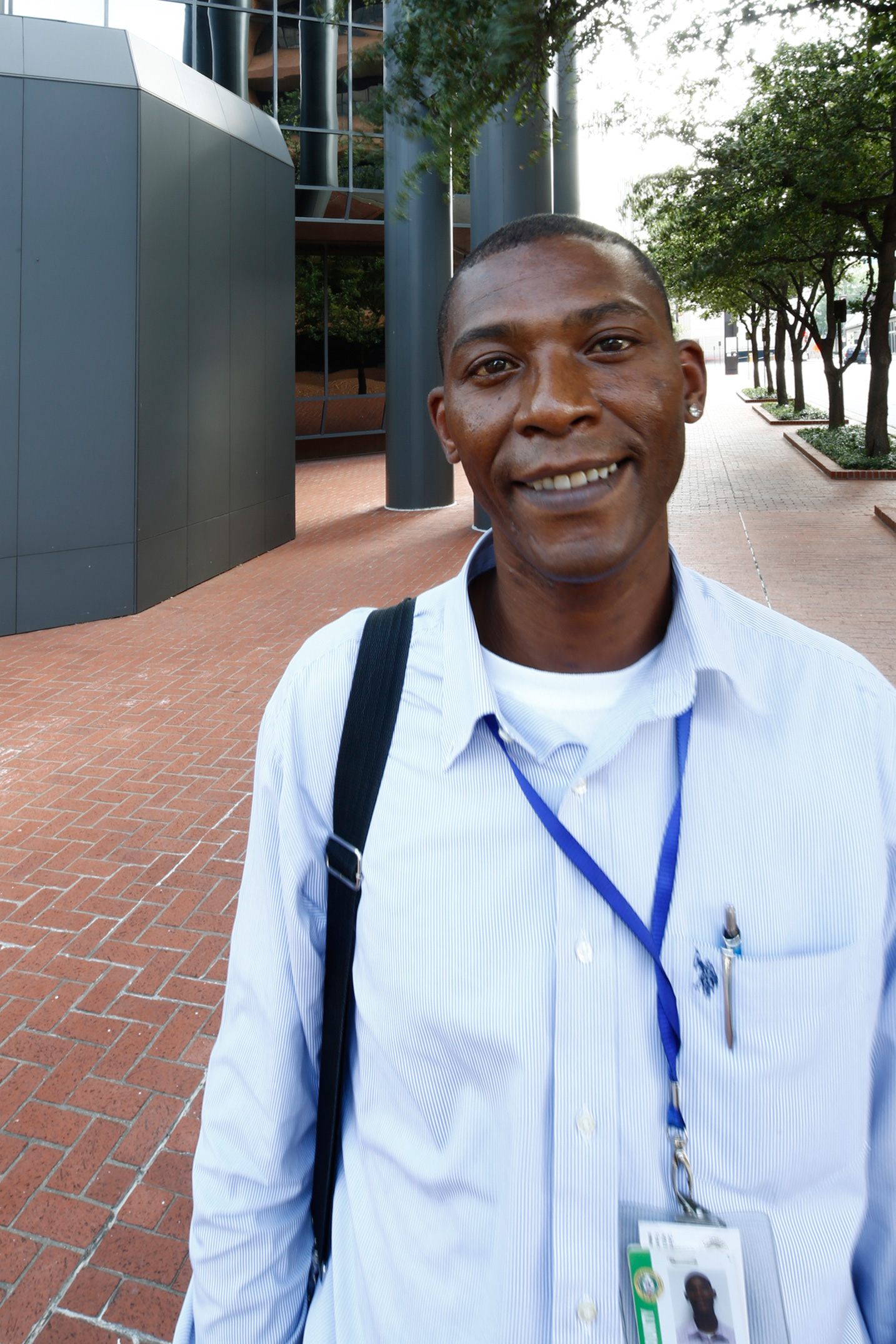
As usual, I met someone who was interesting and encouraging - and interested in my road trip. His name was - and, presumably, still is - Anthony Chavers. As we crossed the street, I asked Anthony what he did. Seemingly by rote, he told me that he answered the phones all day with the Tarrant County Family Law Center, helping people with the process of name changes, family needs, and a variety of other tasks which he seemed to have no energy in describing.

For whatever reason, I blurted out a question that changed his entire demeanor. Suddenly, Anthony became animated, more alive that he'd been just a moment or two ago. I asked him, "But what do you really want to do?" He smiled broadly and proclaimed, "What I really want to do is sing!

Now he had me. He told how he sang in churches, not just his own, but many others, and that he always sang his own songs, never covering the works of others. People loved it, he said. I told him he should always do his own songs, stay true to himself and not perform other songwriters' work.

Tarrant County Family Law Center

Skywalks have always held some fascination for me. For whatever reason, they seem straight out of the Jetson's future. Instead of looking below for traffic, I find myself looking above. . . for flying cars, the one's that were supposed to have been in common use by now. Mine's on order. Yours?

Skywalk between towers

Since it first opened, the Bass Performance Hall has enjoyed a reputation as one of the finest acoustic environments in the world. I've wanted to visit Bass Hall for years but have never had the opportunity. The days of attending concerts on a regular basis have long since passed for me. Nevertheless, as a former audio producer and engineer, I'd find it interesting to experience its sonic excellence. Not having seen the structure before, I was somewhat startled when I came upon it. And I walked around the corner at the perfect moment, with the sun casting a shadow right at the juncture of sidewalk and building. I'm glad I was there to record it.

Bass Performance Hall

When I turned around, I saw that the building behind me, across from Bass Hall, was under construction. I am something of a photographic opportunist. When the moment comes, I would rather strike (or click) while the camera's hot. So much for asking permission. Give me the one from the forgiveness column, thankyouveddymuch. I prefocused, guessed at the exposure, stepped in, squared up my camera on my tripod, fired off a shot, adjusted the exposure and focus, fired two more shots, turned on my heels and was gone in less than 30 seconds. I'm not sure if anyone even noticed me.

Under Construction - Not sure what it's going to be. Didn't see any signs.

A couple blocks over, I saw the Convention Center in the distance. Walking toward it, I came upon a Tribute to John F. Kennedy and his final speeches on November 22, 1963. It was considerably more moving than the assassination-focused 6th Floor Museum in Dallas. Simple. Dignified. A man approached the memorial, quietly, almost reverently, as I finished my photograph. We share a few words and parted. Fort Worth. Dallas. Very different cities.

John F. Kennedy Memorial commemorating the young president's final speeches.

Sometimes it's necessary as a photographer to take small risks, knowing that most people take care of fools and children. It became quickly obvious to my sense of place, perspective, and point of view, that the best place to shoot the Fort Worth Convention Center was from directly in front of the building, in the middle of the street. Watching for traffic with the eyes in the back of my head, I walked to the center of Main Street just on the edge of East 9th Street. Fortunately, I had the passionately vocal assistance of a gentleman who had apparently gotten a head start on the evening's celebrations. But he was adamantly insisting that I was completely crazy for being in the middle of the street paying no heed to his warnings of imminent danger from the two or three cars that passed slowly by me turning onto E. 9th St. Finished with my job, I thanked him in no uncertain terms, and moved on.

Fort Worth Convention Center

Stopping in front of Grace Restaurant in the Frost Bank Building, I saw two gentlemen who were sitting by the window having a conversation over a wee dram. It must have been a private chat. I say this because by the time I had my camera set to capture a square-on image of the building...with the men sitting relaxed by the window...they had decided not to include me in their discussion. Here, I submit to you the image taken the moment after they departed. Note the emptiness. How very sad.

Reflections of Grace in the Frost Bank Building

Flat Iron buildings exist in cities the world over. Fort Worth is no exception. Tiny triangles of real estate that mustn't go to waste, I've always seen them as placeholders. Yet they seem to have reached a special status in architecture. No one knows why.

The Flat Iron Building

What you see here, the W. T. Waggoner Building -- or, rather, its rear aspect -- is what is available to view when the street in front narrows to the point that it is virtually impossible to photograph from the front. And, yet, it is worth considering how breathtaking (literally) it would be to be forced to use the fire escape to abandon such a structure. If you have access to the parking garage across the street from the façade of this magnificent building and would like to share that access with me so that I might do it justice, please contact me. Operators are standing by.

Fire escape side of the W.T. Waggoner Building

Another tower that oil built, this one, currently occupied by Oncor.

Oncor Building

Samuel H. Kress had buildings in most major cities across the U.S.A. But they're now seeing second, third, or even fourth lives, as the never-wed bachelor had no heirs and his properties were liquidated in 1980. Art Deco and Zigzag Moderne styles were the predominant architectural styles employed in most of these buildings. They were well-built, using some of the finest materials, and stand with post offices and railroad depots for their endurance. The Kress buildings are being repurposed rather than razed and what were, for a time, empty shells, are being turned into lofts or a mix of residences and commercial spaces.

Kress Building - Front

I was unable to find out on short notice how this interesting wall in the Kress Building came to be. I assume that the red brick profile is the only remnant of the building next door long ago razed to make room for the present-day parking lot. I'm not sure why I find this so fascinating. It probably says more about my simple mind than it does about the Kress Building's former neighbor. Nonetheless.

Kress Building - Side

I like reflections way too much.

Storefront Reflection

The bell tower of the First Christian Church rang the hour and I came a-'runnin' because I knew there was a   photograph to be made in the advancing twilight. The bell tower, itself, refused to yield up an interesting angle from ground level. But stepping 50 feet to the south gave me this stunning view of the façade. Our friends in the photo unwittingly cooperated with me while I set up my camera, becoming an entry point and, if you will, a launching pad for how one views the image. Squint a bit and you'll see them as the vertex of a triangle that reflects the gable over the six columns.

First Christian Church

As the golden hour gave way to the blue hour, I headed back toward Fort Worth's renowned Sundance Square, when the lovely Westbrook appeared. Named for the Westbrook Hotel, previously on the same spot, it is built of granite and limestone, with brick and aluminum on the façades. The east side of the building along the edge of Sundance Square has a permanent stage for performances. It is a marvelous building and I hope to come back to photograph it in different light and from several more angles.

The Westbrook

My first visit to Sundance Square had me nodding and thinking to myself, So that's what they've been talking about. The Jett Building, canvas to the beautiful Chisholm Trail mural has been restored and is a perfect, human-scaled backdrop to the water feature in the middle of the plaza. The towers looming in the background as giant guardians over the Square completes the scenario of people milling about and through (sometimes) the water jets dancing animatedly for the crowd that surrounds it. Beautiful!

Sundance Square

My last image came after dark as I headed back to the car, tired and hungry, and wanting some rest for the final two days of the Tour in Dallas. I'd passed by the AMC Palace earlier and was a bit non-plussed by its pink resplendence. I shot it but. . . meh. Passing by again, the neon brought it to life and I instantly saw the complete image below in my mind's eye. The final photograph is a composite of 45 different exposures, each contributing or enhancing some element in the image. For me, this is what the building color, the lighting, the location, and the traffic were supposed to accomplish. And with that, I bid you goodnight. See you at the movies!

AMC Palace Theater